James Brinson
Product Designer︱Dallas, TX


© 2024 James Brinson. All rights reserved.
Problem
Checkout is underutilized.
This website echoes web design from 2014, which new and existing users find confusing, unintuitive, and untrustworthy with over 80% of all transactions booked through the support team.
KPIs:
67% of potential clients abandon checkout
0% of first time visitors are converting to sales
32% of email inquiries are information seeking
Before
After
My role
I led the new checkout process.
For 9 months, I guided checkout for an international team of 5 guiding checkout from plan building to a students first booked class.
Contributions:
Checkout user flows, information architecture, product strategy, low/mid fidelity wireframes, high fidelity mockups, creating new UI patterns
Discovery
Low confidence in usability.
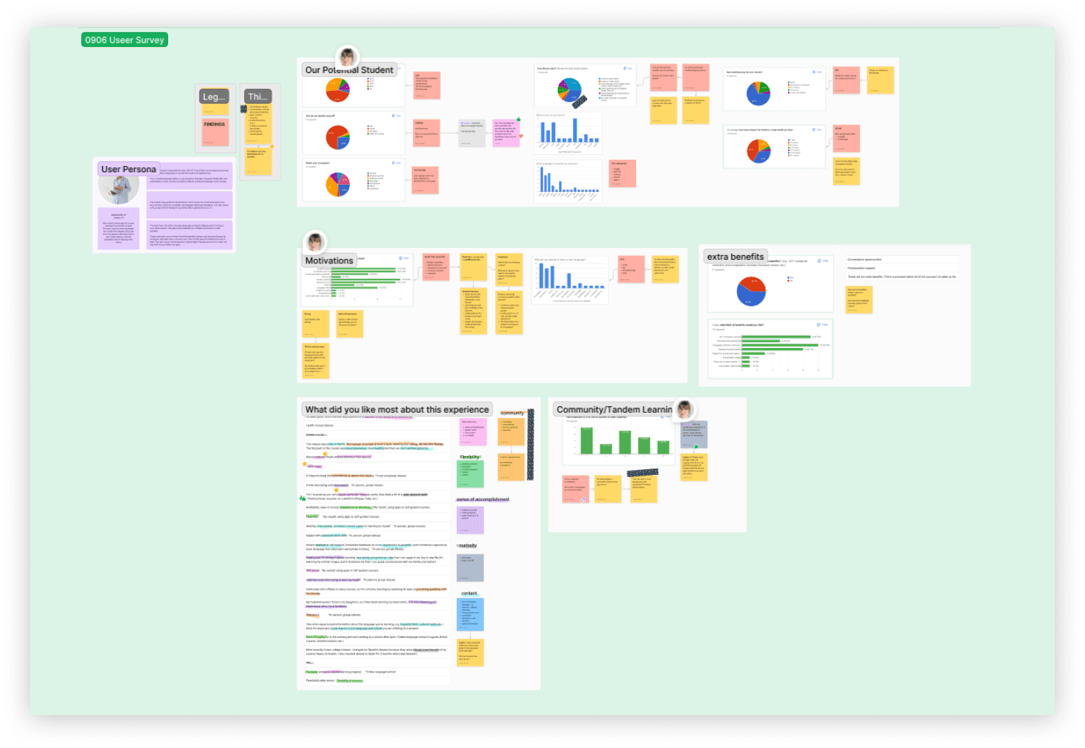
Tackling my KPI's for checkout meant I needed a clearer image on who is booking classes. To get that data I collaborated with our UX researcher in setting up surveys, stakeholder interviews, and usability testing for the current site. Our users echoed 3 confidence issues directly impacting sales: weak branding, poor information architecture, and an outdated cart system.
Key insights:
4/6 users couldn't complete checkout
90% of clients are businesses
Marketing is driven by word-to-mouth
Discovery
Low confidence in usability.
Tackling my KPI's for checkout meant I needed a clearer image on who is booking classes. To get that data I collaborated with our UX researcher in setting up surveys, stakeholder interviews, and usability testing for the current site. Our users echoed 3 confidence issues directly impacting sales: weak branding, poor information architecture, and an outdated cart system.
Key insights:
4/6 users couldn't complete checkout
90% of clients are businesses
Marketing is driven by word-to-mouth
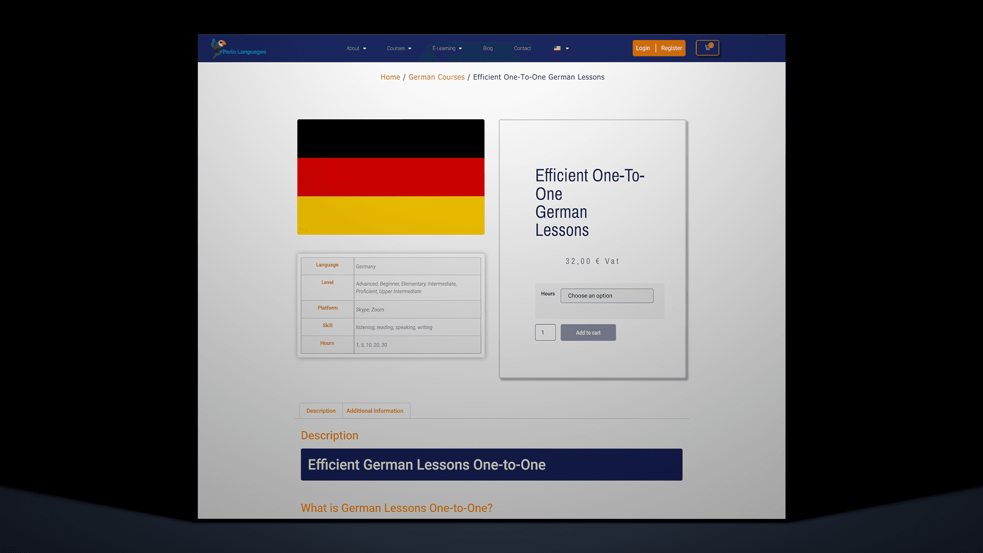
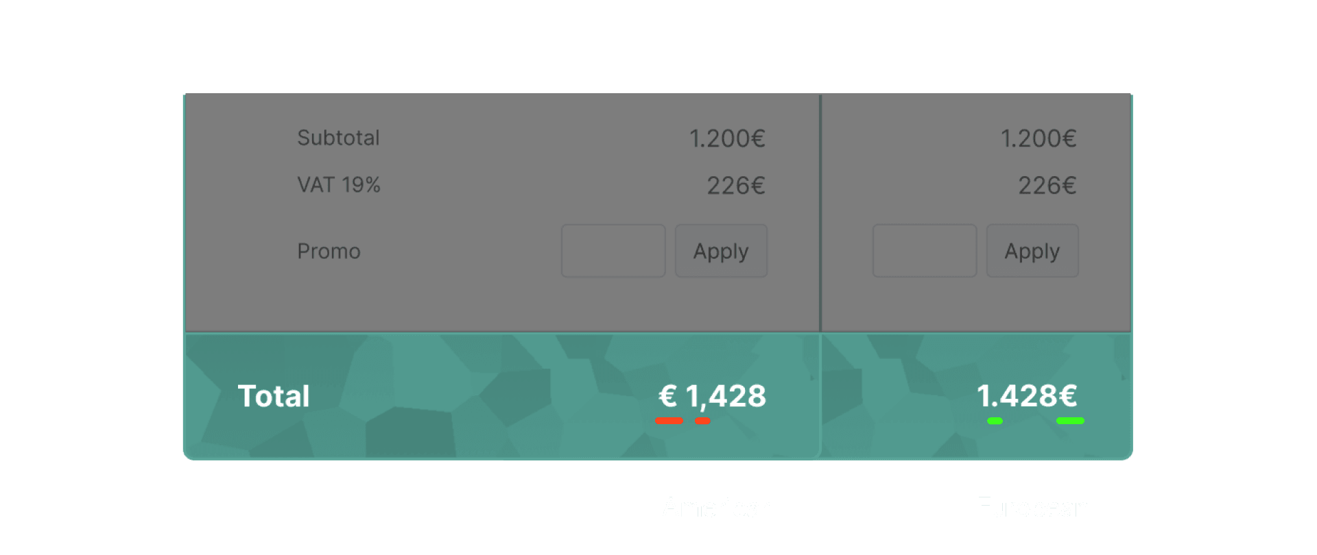
Website audit
The final design
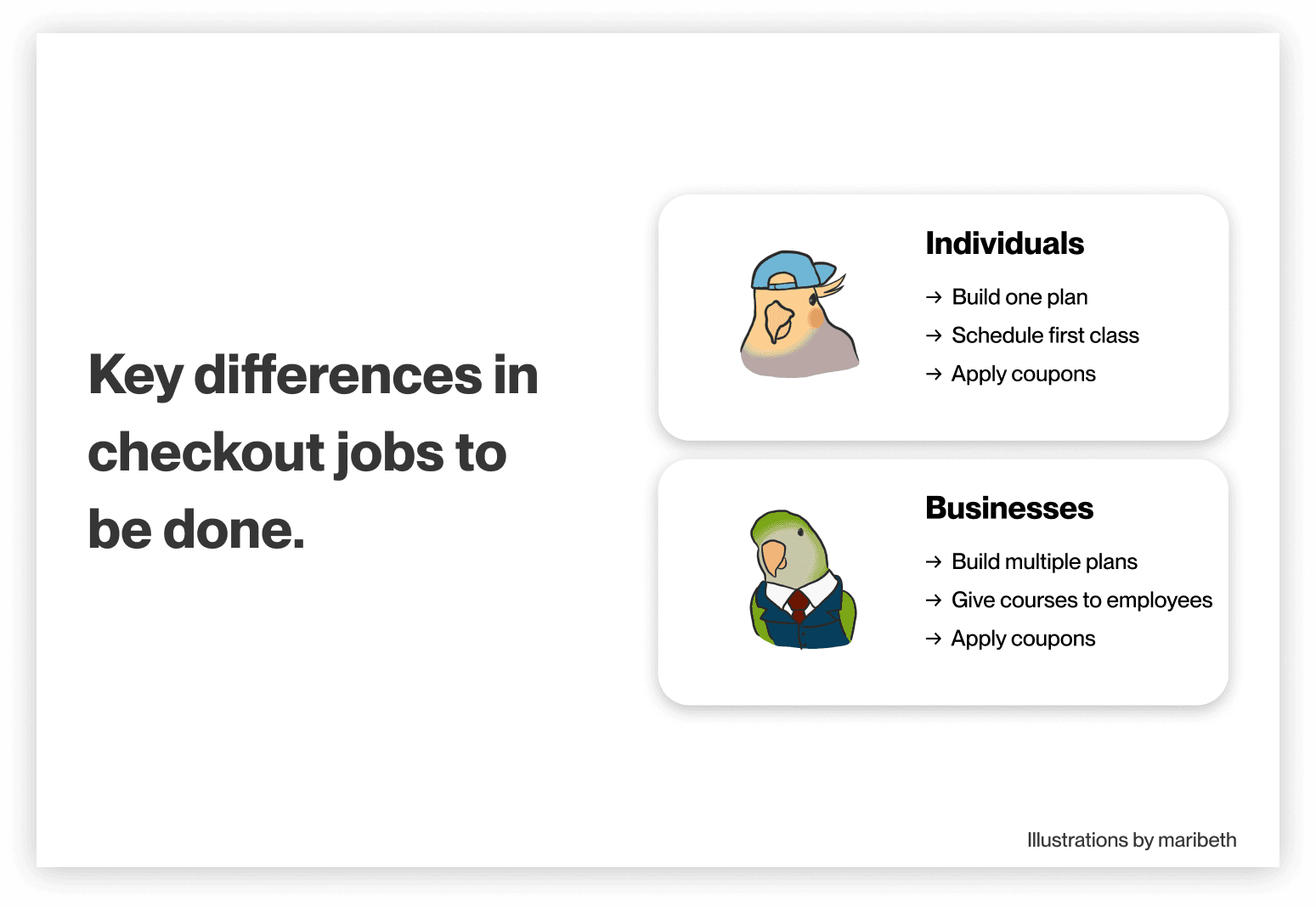
From two portals to one.
Previously, Parlo Languages had separate portals for businesses and consumers. The new checkout flow addressed intersectional European legal systems, involved collaboration with product owners, and introduced new UI patterns. After two iterations of user testing, issues prompting users to contact support were eliminated.
Immediate successes:
10/10 users completed the new checkout
64% reduction in checkout time
Confidence changed from "Untrustworthy" to "Professional"
The final design
From two portals to one.
Previously, Parlo Languages had separate portals for businesses and consumers. The new checkout flow addressed intersectional European legal systems, involved collaboration with product owners, and introduced new UI patterns. After two iterations of user testing, issues prompting users to contact support were eliminated.
Immediate successes:
10/10 users completed the new checkout
64% reduction in checkout time
Confidence changed from "Untrustworthy" to "Professional"
Takeaways
Things I've learned.
1. I'm a confirmed American.
Design choices that I wouldn't have thought twice about didn't align with some German mental models. My team really helped me see the assumptions I didn't even know I had, and made a big impact on my mindset in design.
2. Add value to products.
A large part of me thinks like an entrepreneur, and on this project, I saw an opportunity to leverage that entrepreneurial perspective. Presenting some business and product strategy ideas went exceptionally well, and significantly influenced my approach when engaging with product owners in the future.
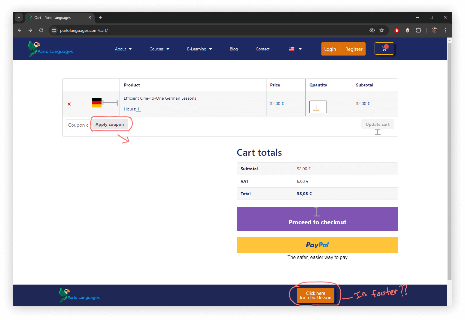
One of my many "American" mistakes while designing with the team.